Poppulo enterprise case study
Workflows
Making automation journeys easier to build, understand and trust
This case study turns the Workflows Figma file into a fuller narrative about designing automation tools for enterprise communications. The source includes workflow builder concepts, journey examples, message previews, logic diagrams and dashboard surfaces. The case study now focuses on the central UX challenge: helping users understand what an automated journey will do before it affects a real audience.
- Role
- Lead UI/UX Designer
- Timeline
- Figma source exported 2026
- Product
- Enterprise workflow builder
- Tools
- Figma, Automation UX, Design systems
Attached Figma source
This case study is based on Workflows.fig
The page uses the supplied Figma export as the project source, with extracted visuals optimised for the web. Private Jira, Confluence and research evidence can be layered into the same data model later.
- Source file
- Workflows.fig
- Figma file name
- Workflows
- Exported
- 10 June 2026
- Board size
- 26,942 x 13,295 canvas export
- Embedded assets
- 50 embedded image assets
Project brief
The brief
Design a workflow-building experience for communication journeys where authors can combine triggers, messages, waits, checkpoints and branching logic. The product needed to make automation feel understandable and governed, not like a hidden set of rules buried in configuration screens.
- Represent workflow logic in a way that can be scanned quickly.
- Help authors configure individual steps without losing sight of the whole journey.
- Provide preview and review states before activation.
- Support operational monitoring once workflows are live or scheduled.
Challenge
Understanding the problem space
Workflow author challenge
Workflow logic is difficult to trust when triggers, steps, waits, conditions and outputs are hidden inside dense configuration screens. Authors need to understand what will happen before activating a journey.
Enterprise challenge
Automated employee communications need governance. Teams need clear visibility of what is live, what is pending and where errors or review decisions may affect real audiences.
Solution direction
- Structured the case study around the Figma source: builder canvas, preview states, journey examples and workflow-management surfaces.
- Focused the narrative on scannable automation logic, launch confidence and reusable workflow patterns.
- Converted selected embedded assets into optimised visuals for the live portfolio.
My contribution
I framed the work around trust in automation. The design challenge was not only arranging cards on a canvas; it was making sure users could predict the consequences of their choices, review audience impact and understand the journey after it was created.
- Explored a canvas-led model for building and scanning communication journeys.
- Structured workflow steps around triggers, messages, waits, checkpoints and branching decisions.
- Connected builder states with preview and dashboard concepts to support governance.
- Prepared the project page for future validation evidence, delivery notes and measurable outcomes.
Insights
What guided the design
01
Logic has to be visible
Users should be able to scan a workflow and understand the sequence without opening every configuration panel.
02
Review prevents costly mistakes
Automation affects real employees, so review states and previews are essential parts of the user experience.
03
Workflows need operational context
Dashboards and status views help teams monitor journeys after they are created, not just while they are being designed.
Design decisions
What the design needed to make clear
Keep the whole journey visible
Workflow tools fail when users have to remember logic hidden inside panels. The canvas gives authors a visible map of the sequence while still allowing detailed configuration.
Treat preview as a safety feature
Preview is not a cosmetic add-on. For automation, it helps users check what messages will be sent, when they will be sent and which conditions affect the audience journey.
Represent waits and checkpoints explicitly
Time-based logic is a common source of misunderstanding. Wait steps and coverage checkpoints need to be visible, labelled and easy to inspect.
Design for after launch
Workflow UX does not end at activation. Dashboard and status surfaces help teams monitor performance, diagnose issues and understand what is currently live.
Process
A reusable design process
-
1
Figma source mapping
Used Workflows.fig as the case-study source and selected representative visuals from the exported board and embedded assets.
-
2
Journey framing
Organised the story around triggers, steps, logic, previews and post-launch monitoring.
-
3
Visual extraction
Optimised builder, preview, logic and dashboard screenshots for accessible presentation.
-
4
Template consistency
Aligned the page with the same shared structure used for Employee app and Events.
Figma artefacts
Selected screens from the attached file
Figma board overview
Board-level view from Workflows.fig showing grouped workflow concepts and automation artefacts.
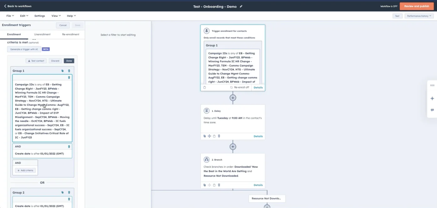
Workflow builder canvas
Canvas-led builder concept for configuring and reviewing a communication workflow.
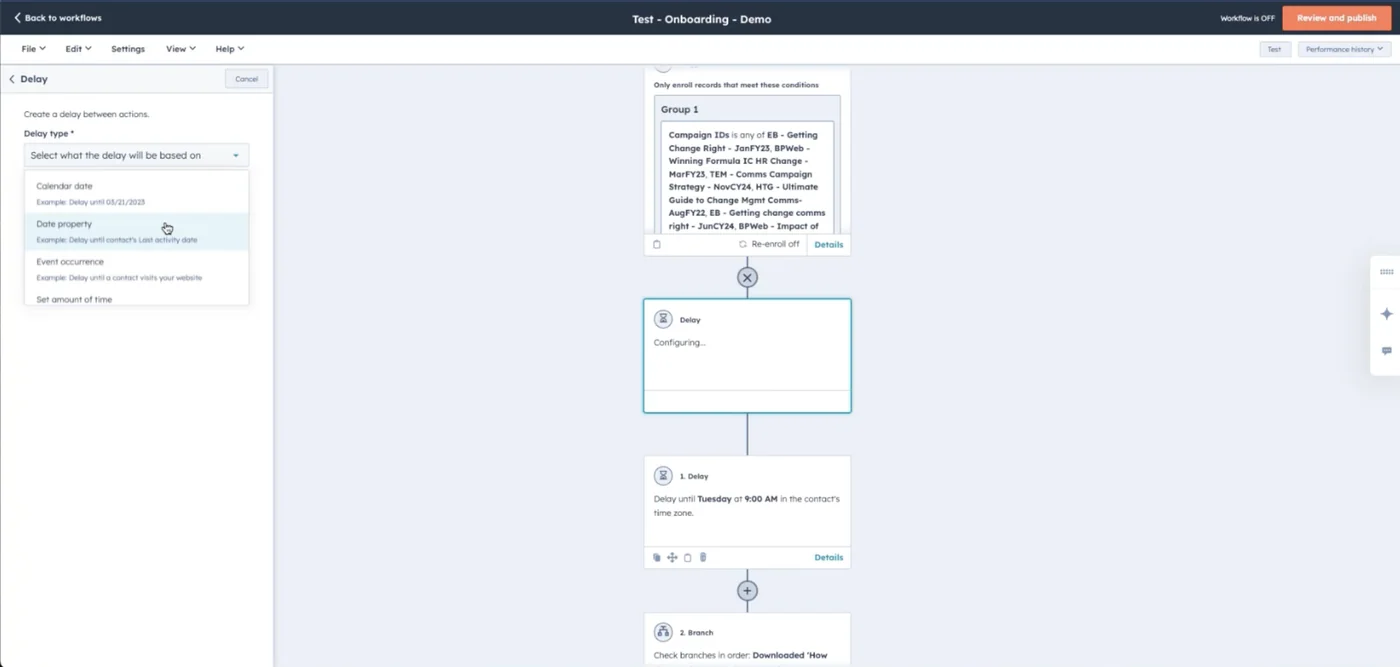
Workflow preview state
Preview-oriented state for understanding the communication journey before activation.
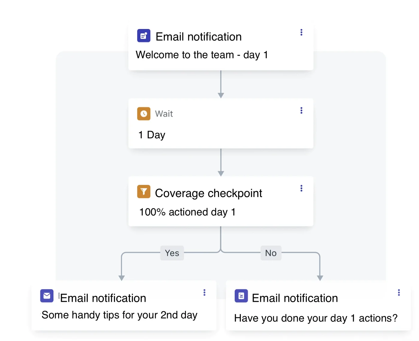
Workflow logic detail
Logic-focused artefact showing how waits, checkpoints and branches can be represented.
Design system
Automation pattern system
The Figma source supports a design-system story around reusable step cards, canvas layout, configuration panels, validation states, journey previews and dashboard status patterns.
Scannable workflow canvas
The builder visuals show a canvas-led model where authors can understand a communication journey at a glance.
Journey preview and governance
The selected artefacts include preview and dashboard concepts that support confidence before and after activation.
Accessibility considerations
Inclusive product details that matter
- Canvas interactions should have keyboard-operable alternatives and structured step lists.
- Workflow status should be exposed with text labels, not colour alone.
- Configuration panels should use semantic form controls with clear validation messages.
- Zoomable or complex diagrams should include a readable linear summary of the workflow sequence.
Outcomes
Impact and product contribution
- Replaced the placeholder Workflow Builder page with a complete Workflows case study based on the supplied Figma file.
- Clarified the product contribution: making automation logic visible, reviewable and safer to activate.
- Documented the design decisions behind canvas structure, preview states, wait logic and operational monitoring.
- Added optimised Figma-derived visuals while keeping the case study honest about missing validation metrics.