Poppulo enterprise case study
Employee Experience App
Concept testing a more useful employee mobile experience
This project was set up to explore the usefullness and desire for an employee experience mobile app. I worked to create a mid-fidelity concept board rather than a hi-fi pixel perfect design, so the page focuses on the design problem, product framing, concept decisions and what would need to be validated next.
- Role
- Senior UI/UX Designer
- Timeline
- Q4 2024
- Product
- Employee experience app concept
- Tools
- Figma, Miro, Concept testing
Project brief
The brief
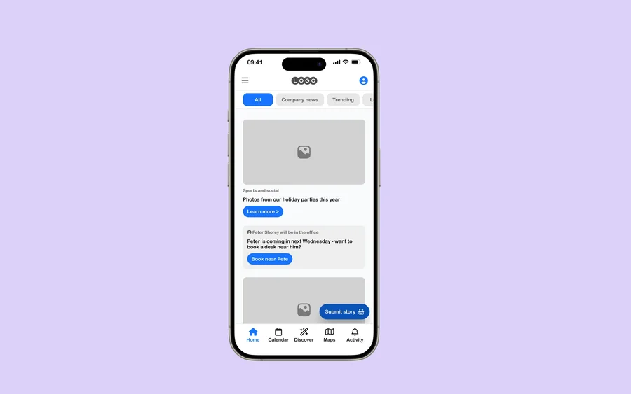
Explore whether an enterprise employee app could become more than a communications feed. The concept needed to test a super-app direction: one mobile destination where employees can understand what is happening, complete common tasks and reach the services they need without jumping across disconnected tools.
- Define a stronger mobile information architecture for a broad employee experience.
- Make high-frequency employee needs easier to reach from the app home screen.
- Use mid-fidelity screens to test comprehension before committing to detailed visual design.
- Create a structure that could scale across communications, services, tasks and support moments.
Challenge
Understanding the problem space
Employee challenge
Employee-facing mobile experiences can become fragmented when updates, tasks and support moments are handled as separate destinations. The concept needed to test whether a more unified app model could make the experience easier to understand.
Product challenge
A super app direction requires a clear information model. The design had to explore what belongs in the core navigation, how content should be prioritised, and how new features could scale without turning the app into a cluttered hub.
Solution direction
- Created a mid-fidelity concept-testing board that explores the structure of a broader employee app experience.
- Used mobile screens and flow groupings to compare navigation, content hierarchy and feature entry points.
- Kept the public case study truthful to the Figma source while leaving space for future research evidence, Jira decisions and Confluence context.
My contribution
I treated the Figma board as a concept-testing artefact and shaped the case study around the product questions it raises. The work sits at the intersection of IA, mobile UX and enterprise product strategy: deciding what should be prominent, what should be secondary, and how a broad employee app can avoid becoming an overloaded menu.
- Framed the problem around fragmentation in employee-facing mobile experiences.
- Explored app structure, home-screen hierarchy and feature entry points.
- Kept the design at mid fidelity to support faster critique and concept validation.
- Prepared the case-study structure for future research notes, stakeholder decisions and product metrics.
Insights
What guided the design
01
A super app needs sharp prioritisation
The homepage and navigation need to distinguish what employees need daily from what they only need occasionally.
02
Concept tests should expose trade-offs
Mid-fidelity screens make it easier to discuss structure, sequencing and comprehension before visual polish dominates the review.
03
Mobile utility must be earned
An employee app becomes useful when it connects communication with practical actions, not just announcements.
Design decisions
What the design needed to make clear
Prioritise daily jobs over feature inventory
A super app can quickly become a dumping ground. The proposed structure gives priority to the tasks and updates employees are most likely to need frequently, while leaving lower-frequency services available but less dominant.
Use navigation to communicate the product model
The navigation is not just a wayfinding device. It explains the mental model of the app: updates, actions, services and personal context need to feel intentionally grouped rather than stitched together.
Test structure before visual polish
The mid-fidelity approach makes it easier to challenge labels, order, grouping and comprehension before colour, imagery and motion make the concept feel more finished than it is.
Process
A reusable design process
-
1
Source review
Used the EmployeeApp.fig export as the primary case-study source and preserved its Figma file name, board metadata and concept-testing focus.
-
2
Experience framing
Reframed the public page around the design problem implied by the board: validating a connected employee app concept before deeper product commitment.
-
3
Template alignment
Mapped the project into the shared case-study structure so it stays consistent with Events and Workflows.
-
4
Evidence slots
Left the page ready for future additions such as test findings, stakeholder quotes, success metrics and implementation decisions.
Figma artefacts
Selected screens from the attached file
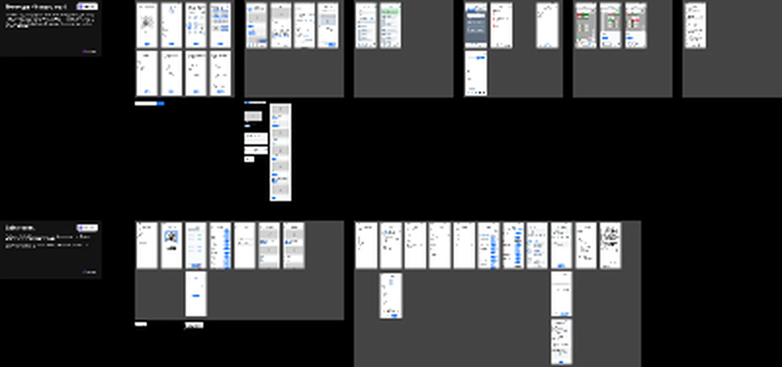
Figma board overview
Board-level view from EmployeeApp.fig showing grouped mobile concepts for super app testing.
Design system
Mobile concept structure
The project page presents the Figma board as an artefact-driven case study. It keeps design-system claims conservative until final components, variables and production decisions are supplied.
Concept-testing artefact
The source file is explicitly identified as a mid-fidelity testing board rather than a finished product launch claim.
Reusable case-study frame
The page uses the same challenge, insights, process, system and outcome structure as the other project pages.
Accessibility considerations
Inclusive product details that matter
- Mobile navigation should remain operable with large touch targets and predictable tab order.
- Information cards should not rely on colour alone to show priority or status.
- Critical tasks should use plain-language labels rather than internal product terminology.
- The experience should support dynamic text sizing and avoid truncating essential task labels.
Outcomes
Impact and product contribution
- Reframed the Employee App project as a concept-testing case study instead of a placeholder page.
- Clarified the product opportunity: a more connected employee mobile experience that brings communications and utility together.
- Documented the key design questions that need validation before progressing to high-fidelity design or delivery.
- Created a reusable evidence-ready structure for adding research findings, stakeholder feedback and implementation outcomes later.