Employee experience:
Mobile, MS Teams and Sharepoint
An employee communications experience that meets employees in the spaces they spend their time.
Role
Lead UI/UX Designer
Duration
2022 - 2024
Tools
Figma, Miro, Dovetail
Understanding the Challenge
The Problem
Employees received communications across
mobile, MS Teams, and SharePoint - but each surface
felt disconnected. Content lacked consistency,
context, and continuity. Messages were delivered,
but not experienced as part of a cohesive system,
reducing clarity and engagement.
Communicators worked within siloed
channel-based tooling, prioritising distribution
over experience. Each channel required separate
setup and formatting, with no central way to design
how communications appeared across surfaces. The
tools enabled sending, not employee experience.
The Solution
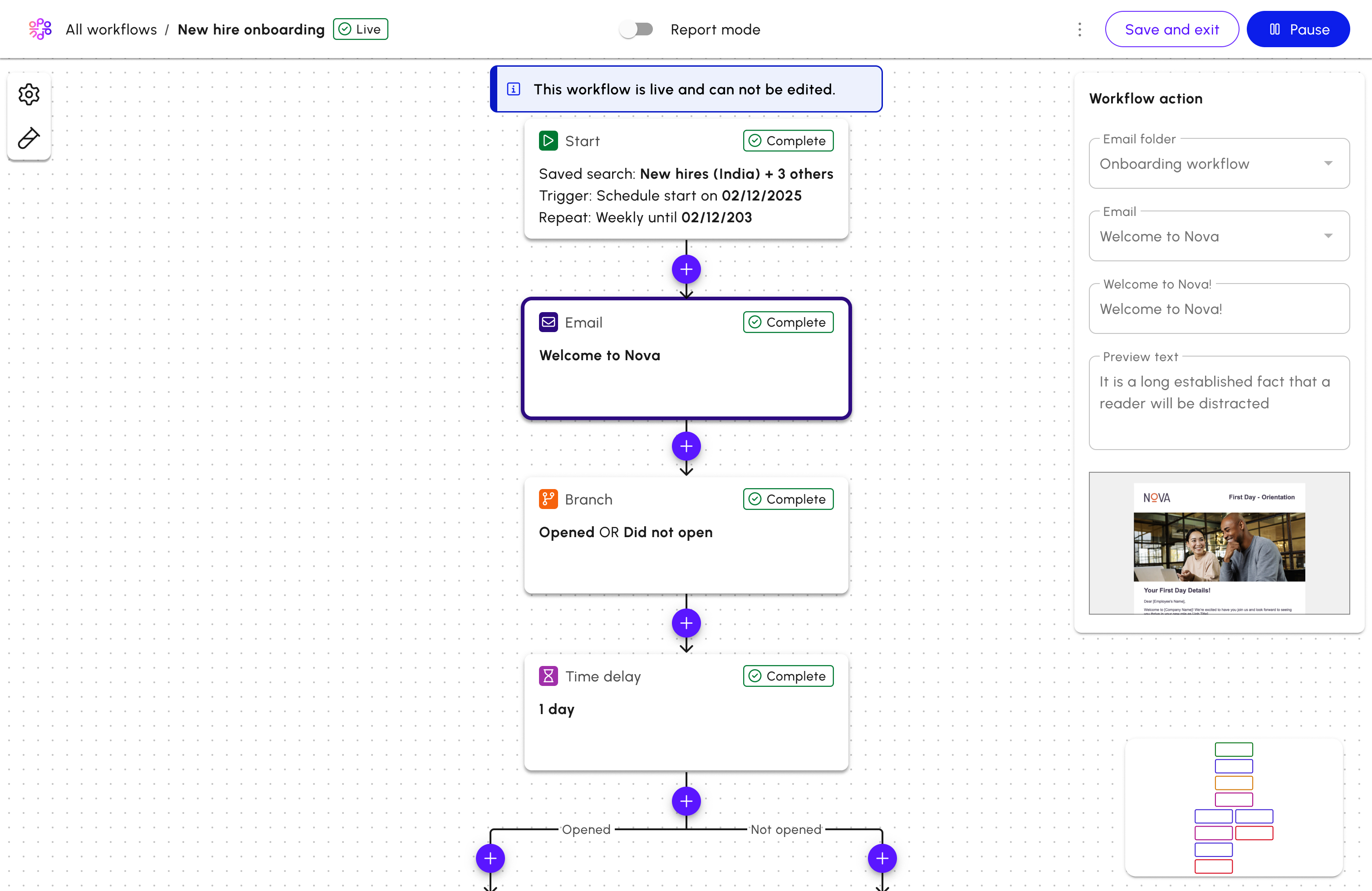
Phase 1: Standardising the endpoints (Hi-Fi)
I designed high-fidelity mobile, MS Teams, and
SharePoint integrations to create a consistent
cross-platform experience.
Phase 2: Reimagining the IC workflow (Lo-Fi)
I explored a new communicator experience that
centralised channel management and introduced
goal-led workflows.
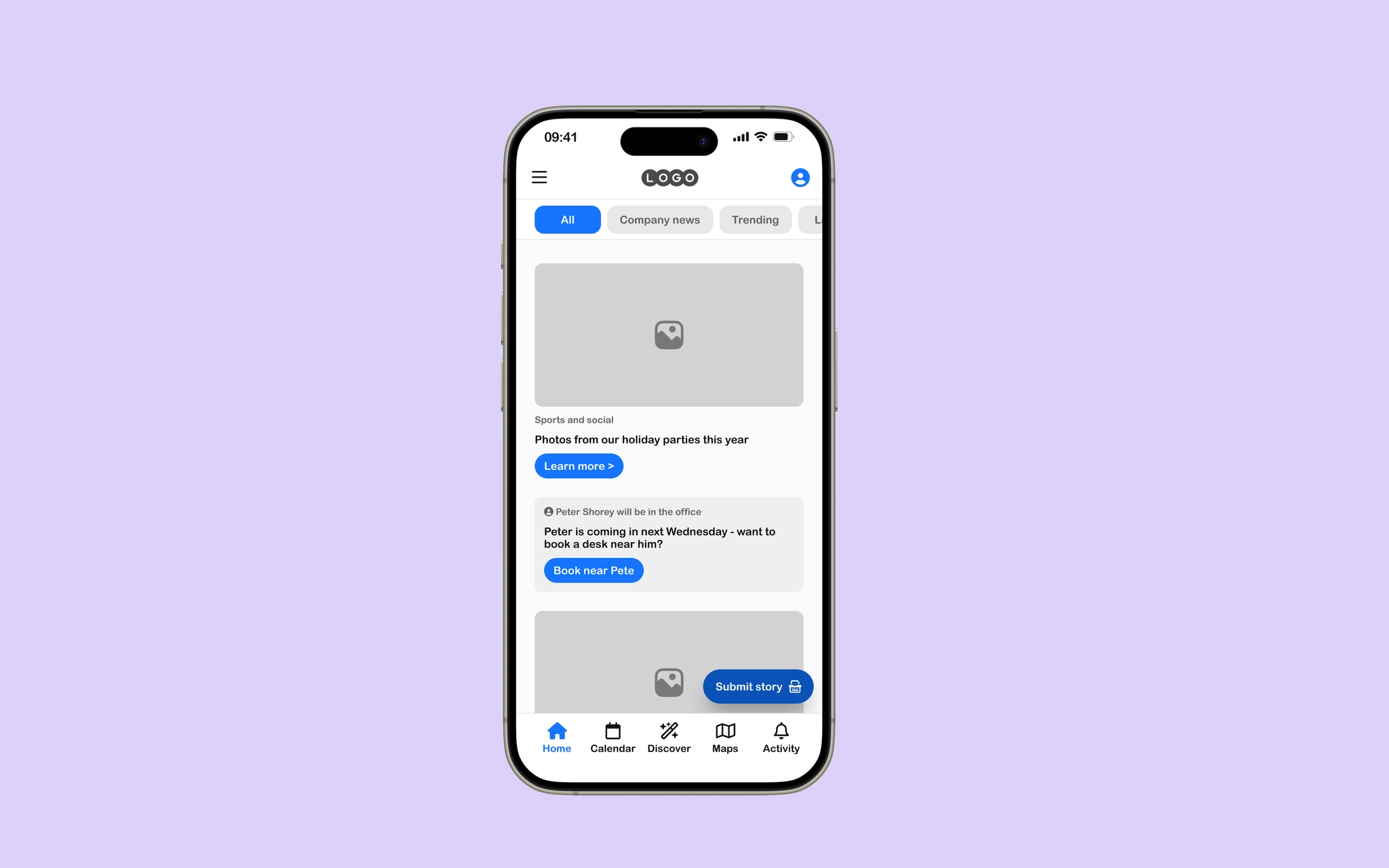
Phase 3: Expanding the employee experience
(Mid-Fi)
I evolved the mobile app beyond communications into
a broader employee hub.
User Research & Insights
After interviewing 15 environmentally conscious shoppers, three key themes emerged that guided the entire design direction.
Convenience is King
85% of users stop tracking after 3 days if they have to manually input data. Automation was non-negotiable for retention.
Data Overload Paralysis
Users felt overwhelmed by raw CO2 numbers. They needed relative scores (e.g., "Good", "Average") to take action.
Community Motivation
Users were 2x more likely to stick to sustainable habits when they could see the collective impact of their social circle.
The Design Process
Visual Identity
Color Palette
#0D59F2
#101622
#10B981
#94A3B8
Typography
Inter Bold
Inter Medium
Aa Bb Cc Dd Ee Ff Gg Hh Ii Jj Kk Ll Mm Nn Oo Pp Qq Rr Ss Tt Uu Vv Ww Xx Yy Zz 1234567890

Seamless API Integration
We connected directly with major banking APIs to allow for automatic purchase categorization. Users don't need to manually enter data; the app learns their habits and provides real-time impact assessments as they spend.
- verified 99% accuracy in merchant categorization
- verified Secure OAuth 2.0 banking protocols
Smart Substitution Engine
Instead of just showing the damage, we focused on the solution. Our recommendation engine suggests local, sustainable alternatives for frequently purchased items, calculating exactly how much CO2 the user could save.

Results & Impact
4.8
App Store Rating
1.2M
CO2 Tons Saved
65%
User Retention
200k
Active Users
Next Project
Workflow builder